




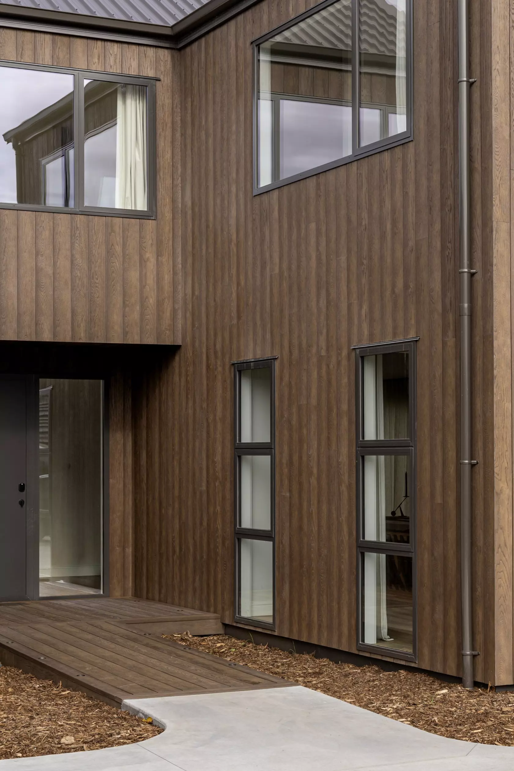
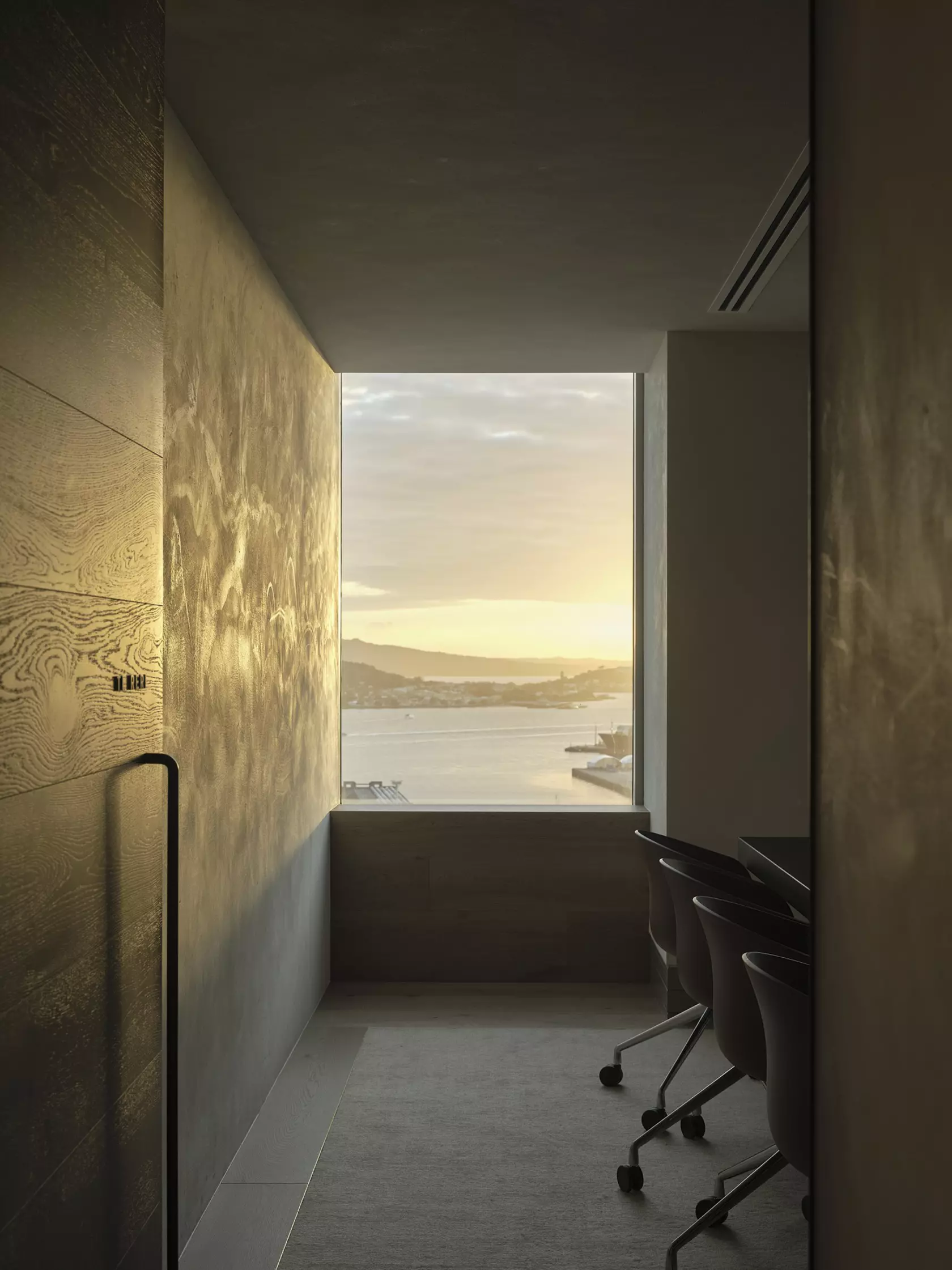
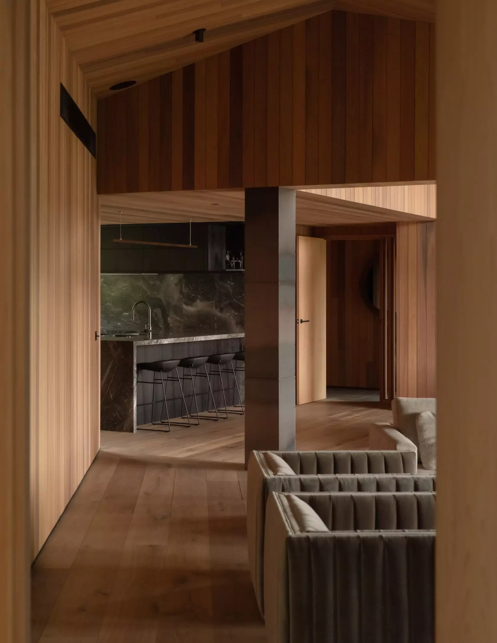
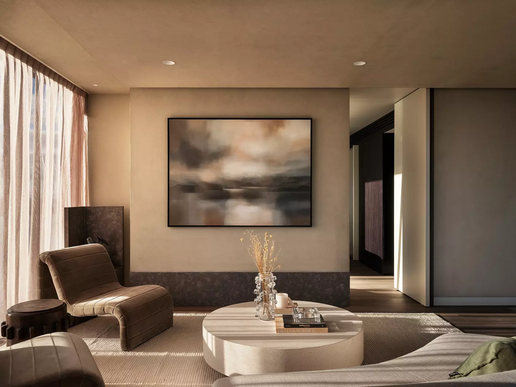

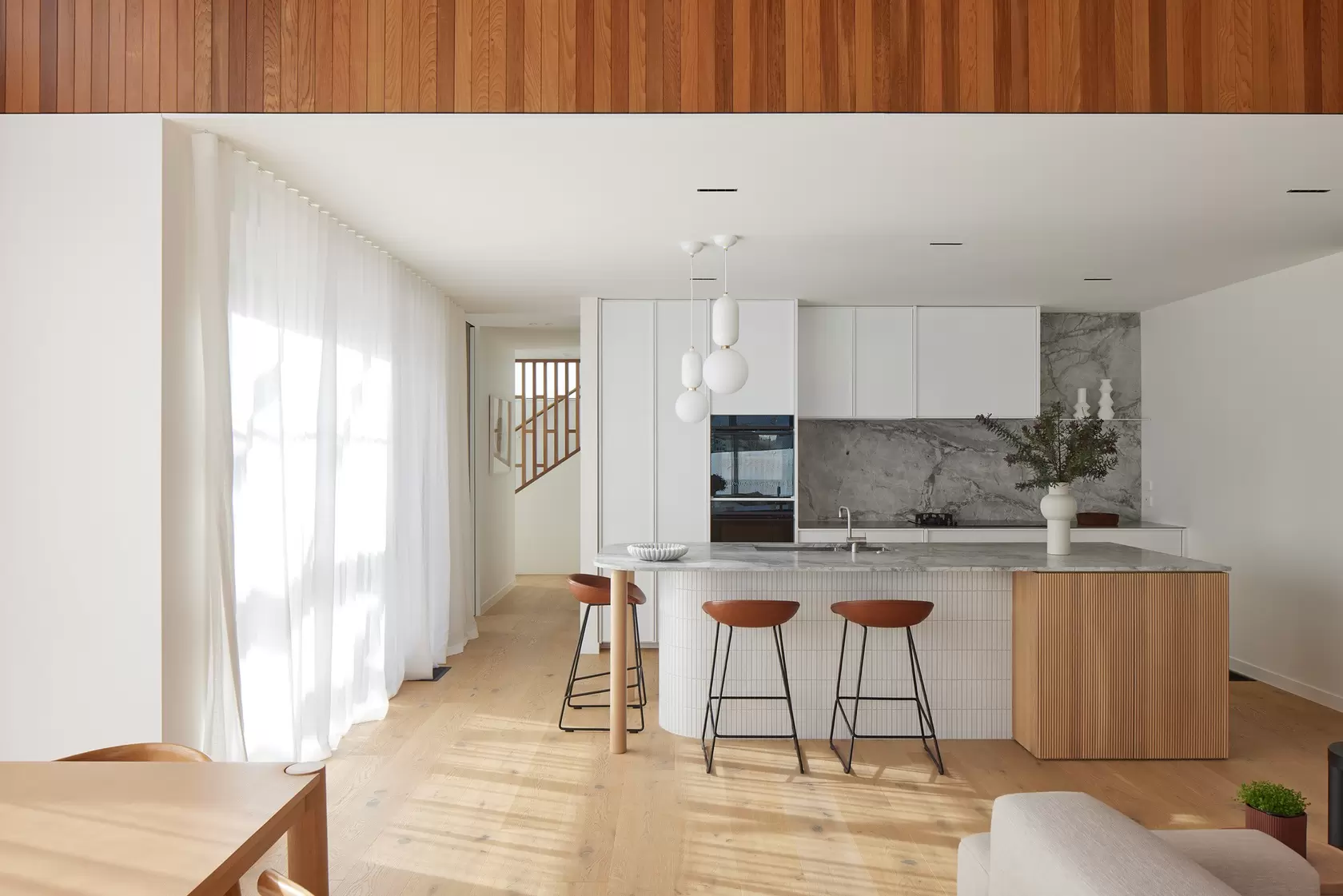
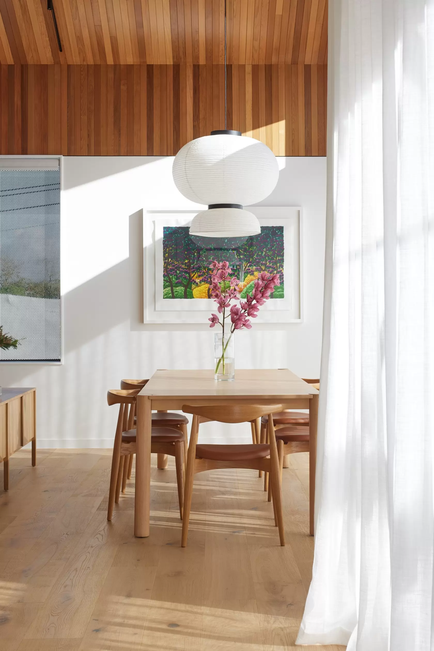
Set on a corner site among Westmere's heritage villas and modern infill, this new build was designed around a single idea: chase the light, and let the house change mood as the day moves through it. Oversized glazing and tall gable windows draw the northwestern sun deep into the open kitchen and living space, while cedar-lined ceilings fold down into a timber band that traces the walls and lifts the eye toward the gables above.
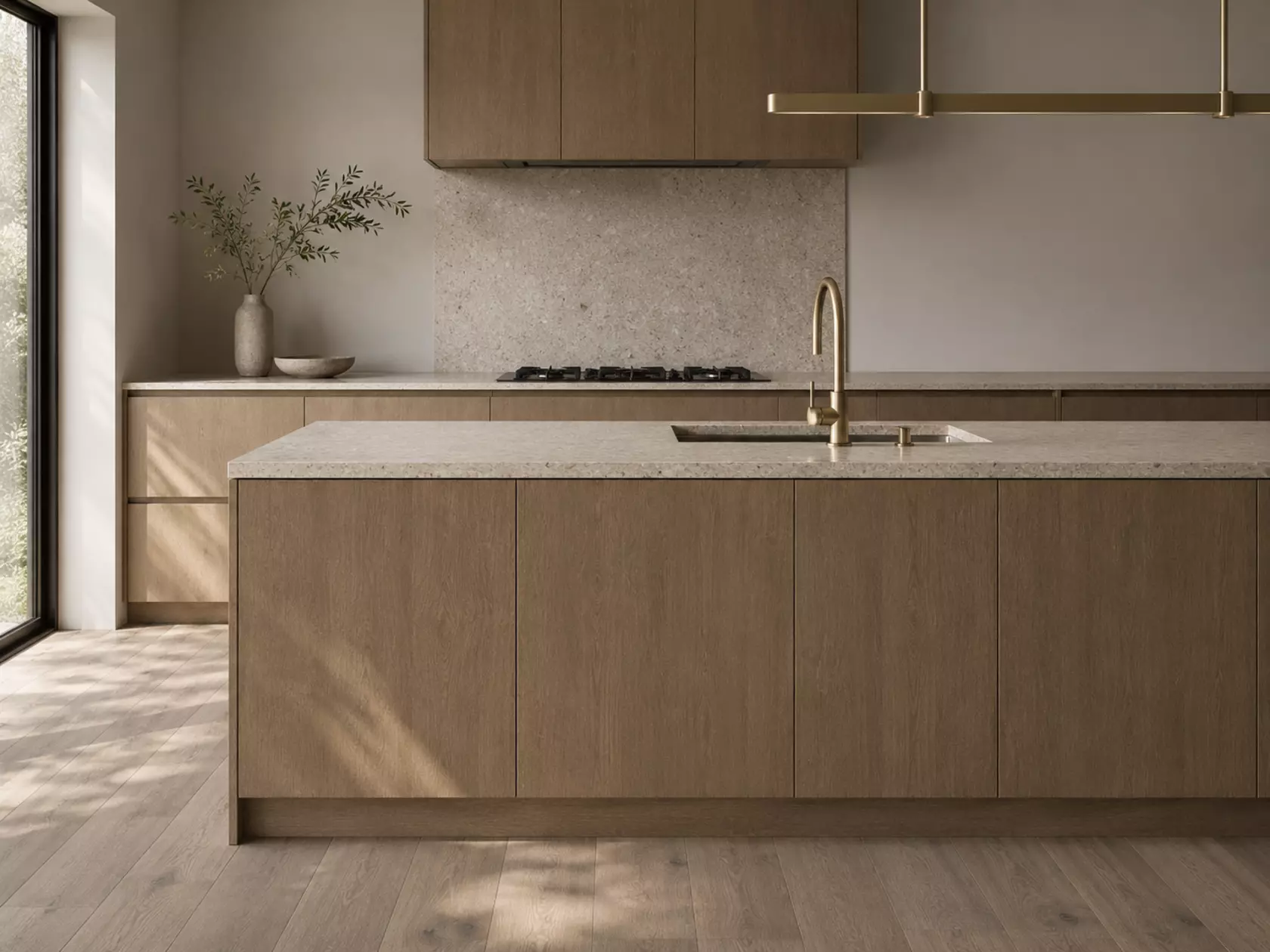
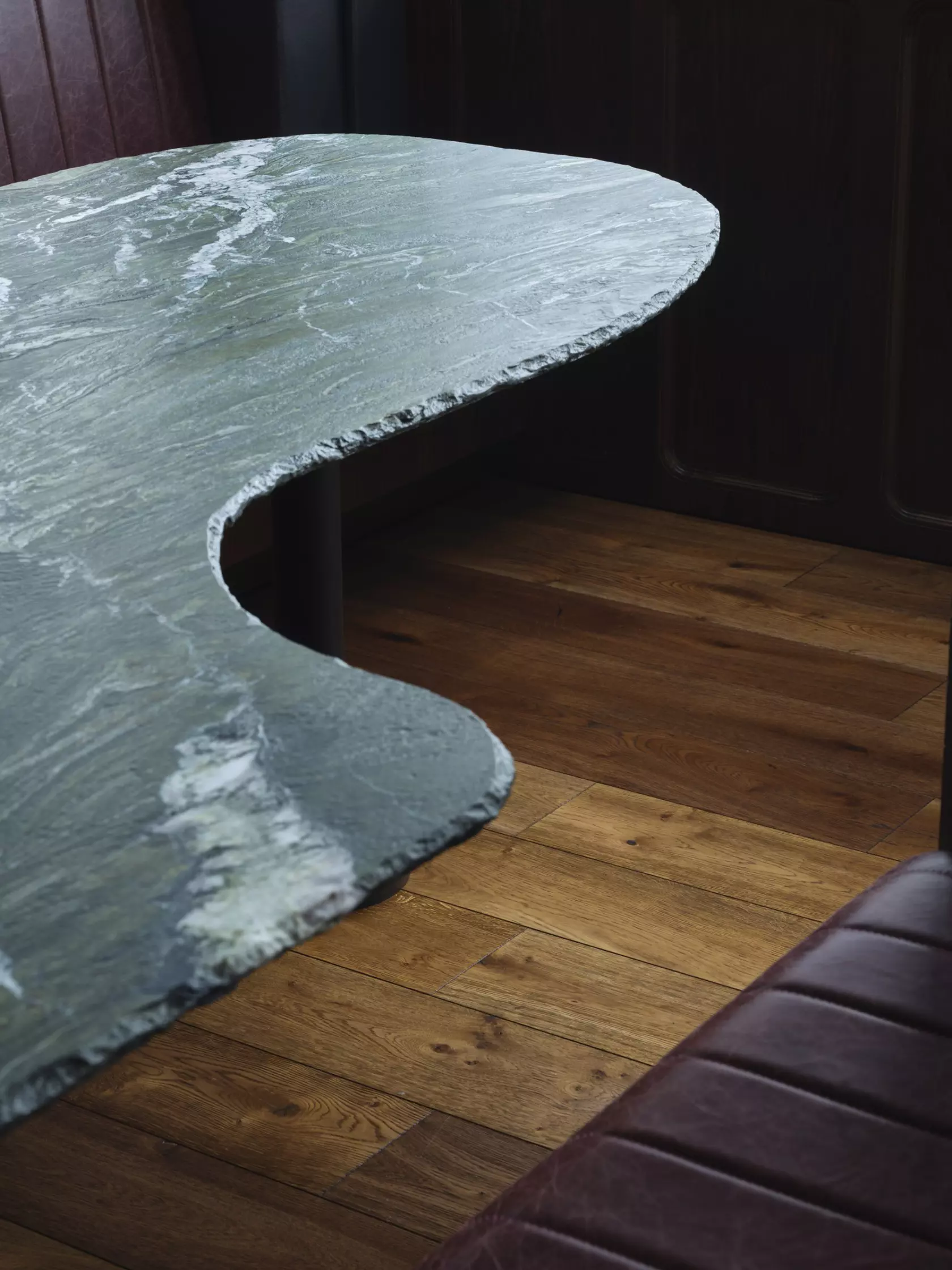
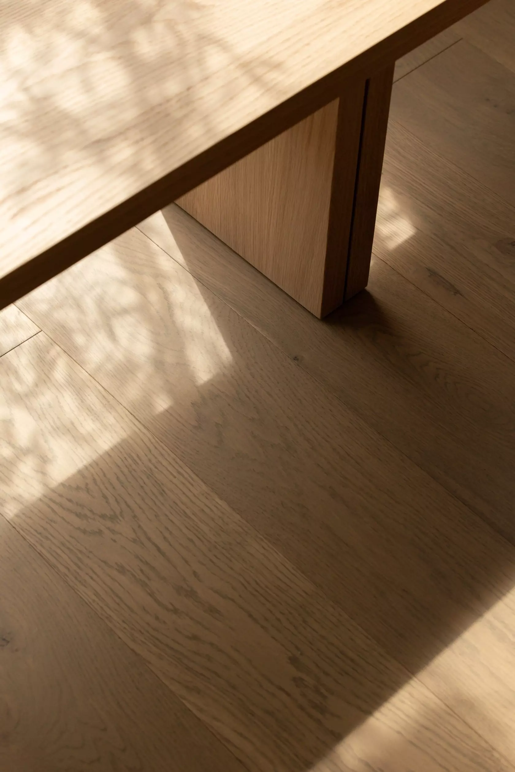
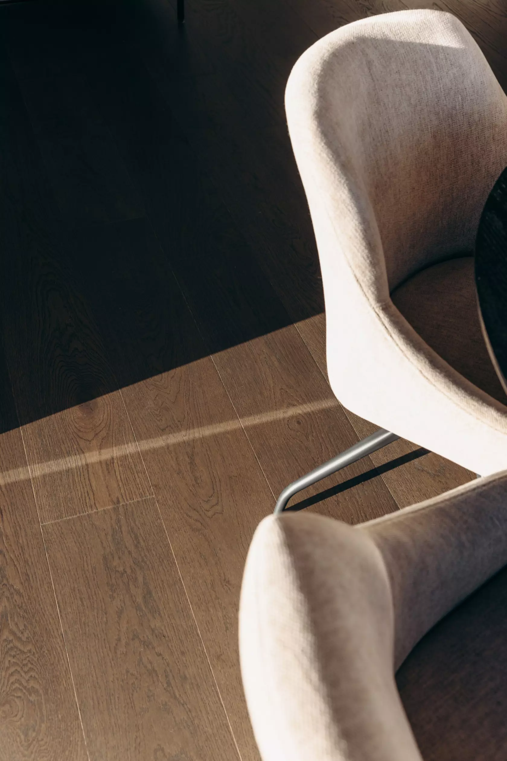
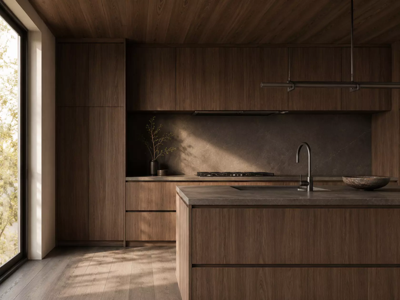
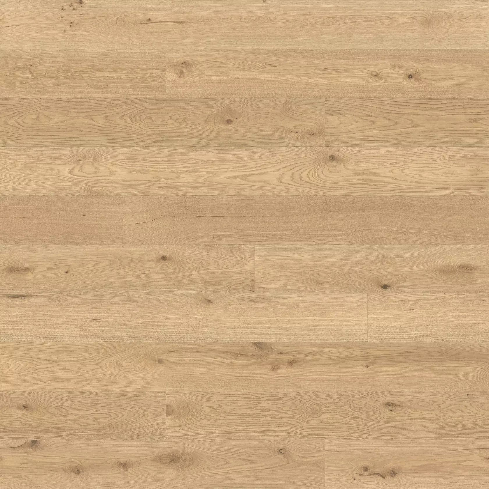
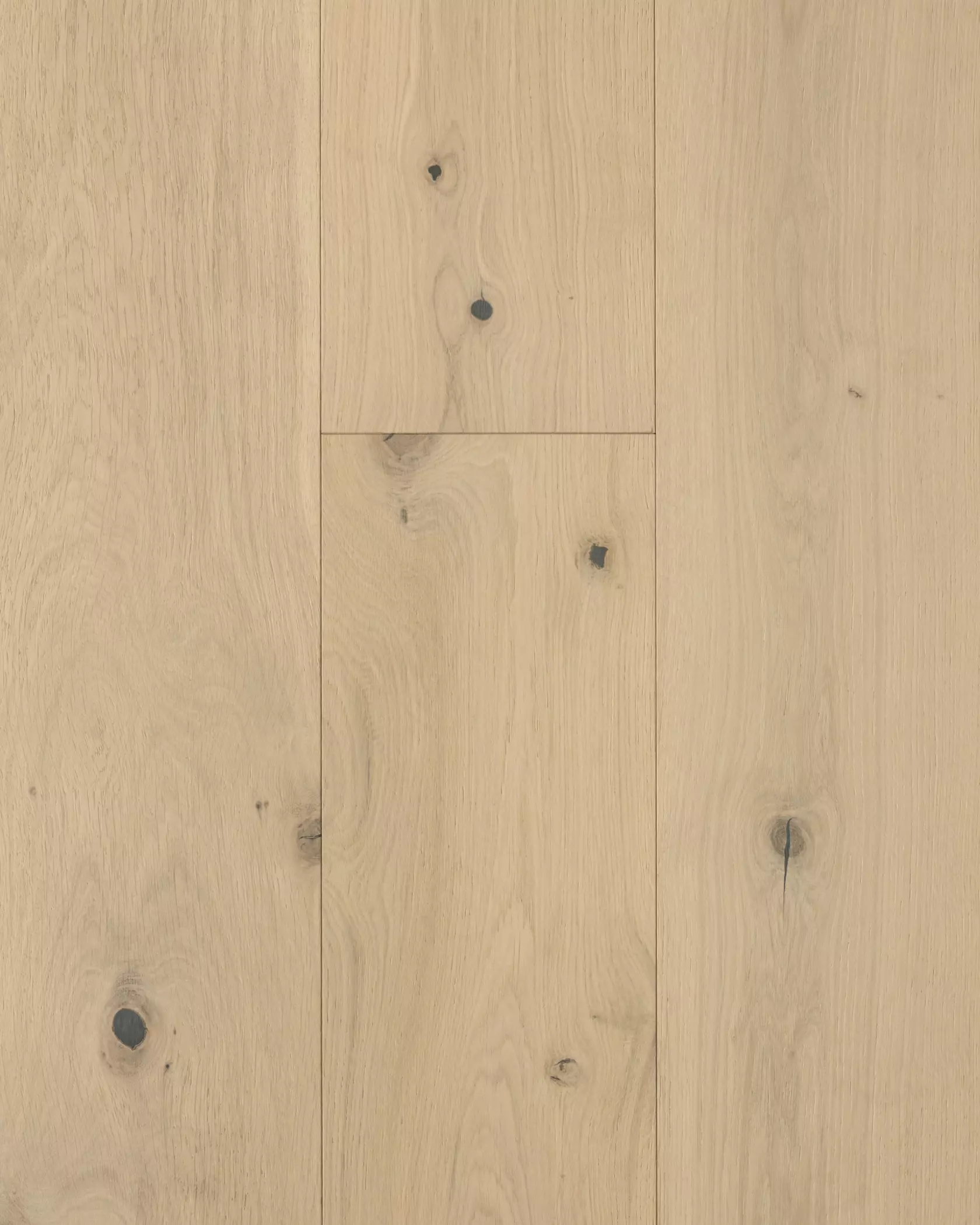
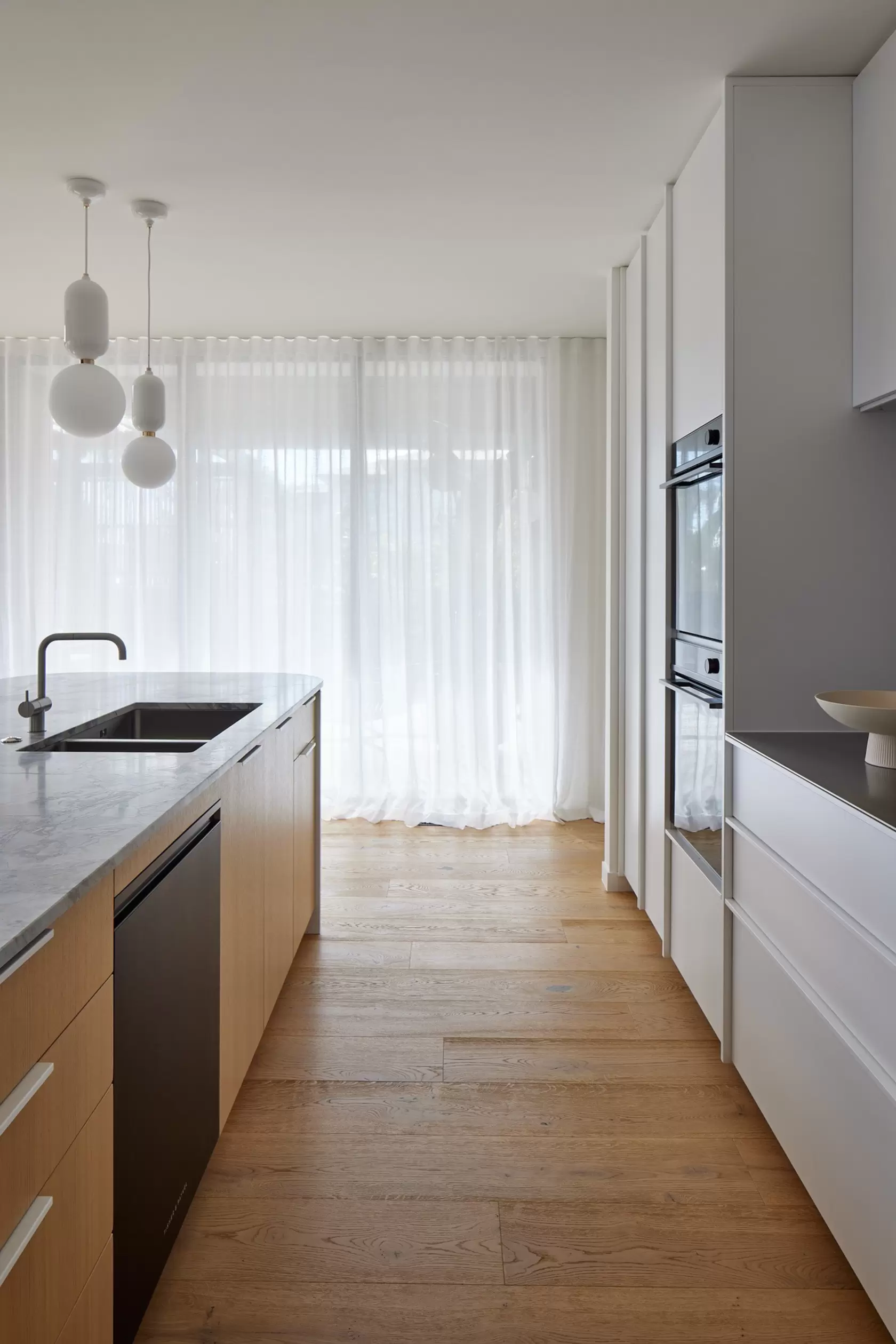
The material palette carries the same warmth throughout — terracotta and forest-green tones set against dark marble, with Moda Capri's light, golden-hued oak running underfoot and echoed in a hand-crafted stair screen that filters sunlight as it shifts across the day. At the centre of the home, a white steel kitchen earned the 2025 TIDA Award for Architect Designed Kitchen, built to support a family who lives through food and easy hospitality.
Read on below for our interview on the project with architect and homeowner Eva Nash.
What made you want to design a new build, rather than adapt or renovate the existing home on the site?
We felt a new house gave us the opportunity to respond properly to the site, the sun and the way our family actually lives. The new house is carefully arranged around the light and the garden, with the spaces connected in a way that makes the house feel generous.
As the name suggests, the home is a real sun-catcher. You've talked about wanting the house to feel light-filled without ever being glary, which sounds like a tricky balance to strike. What were the actual tools you leaned on to harness and control that light?
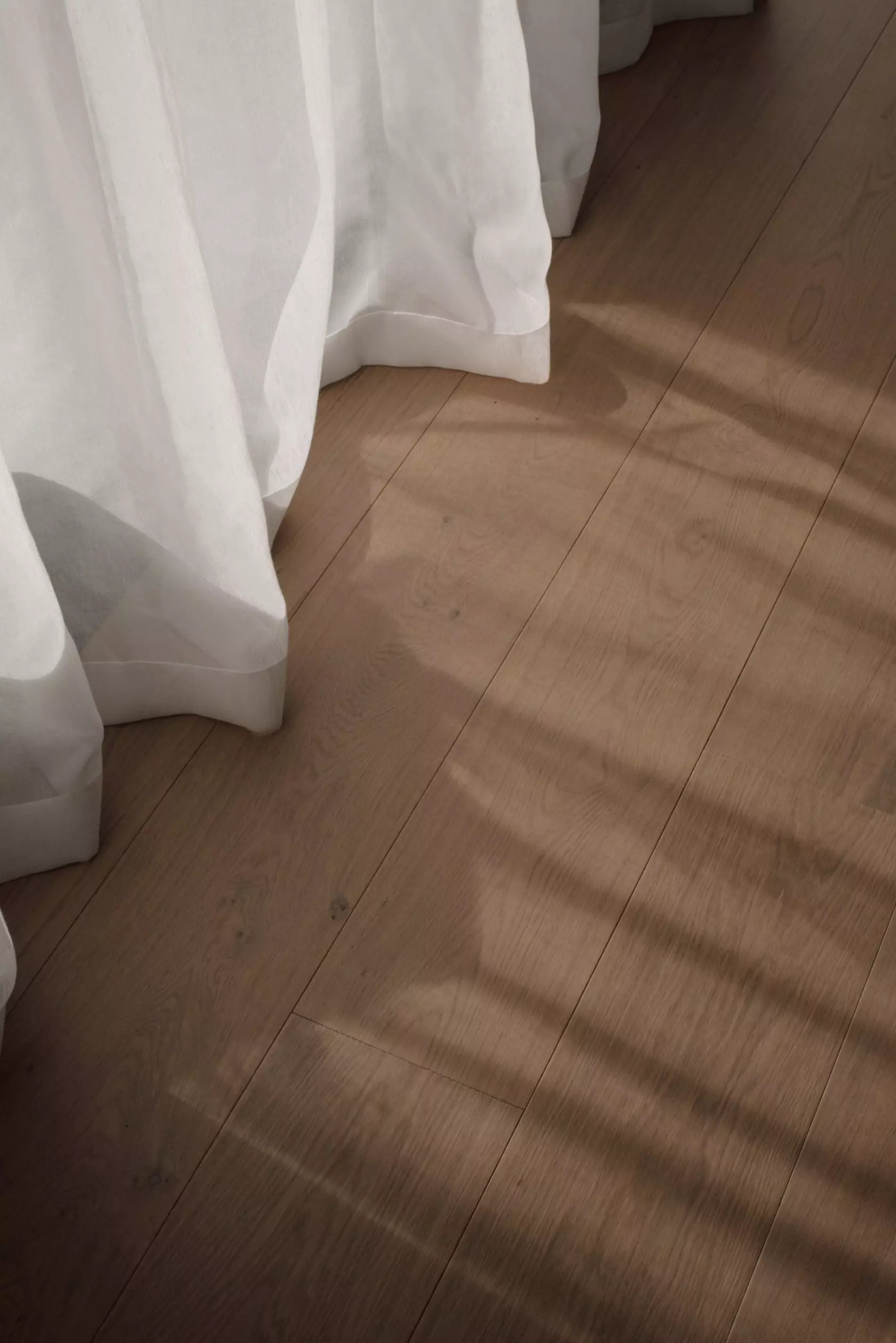
We used a series of layers to filter, soften and control the light. Perforated metal screens were an important part of this. Over the large living room window, a folded, pleated screen creates an origami-like layer that filters the strong western light while still allowing views out. Outside the kitchen, the perforated metal continues as a vertical pergola-like element, providing another layer of sun control. Inside, linen curtains add a softer layer of filtering, while carefully positioned skylights bring light in. Frosted windows were used where we wanted daylight without compromising privacy. We also used oak screens internally to filter light between spaces. So rather than relying on one solution, we used a combination of elements to create different qualities of light throughout the house. The result is a home that feels bright and connected to the sun, but where the light is always moderated and considered.
What led you to Moda Capri for the flooring specifically?
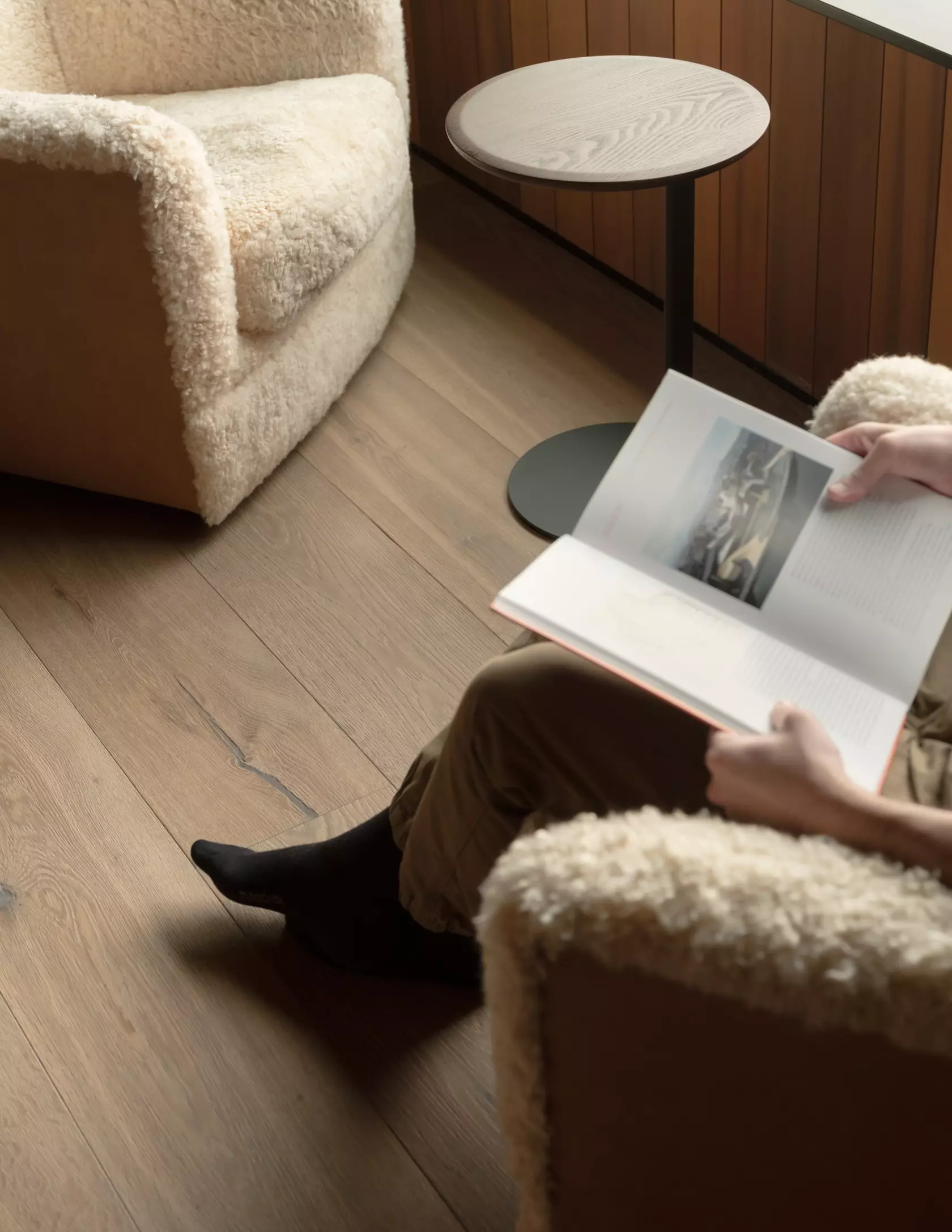
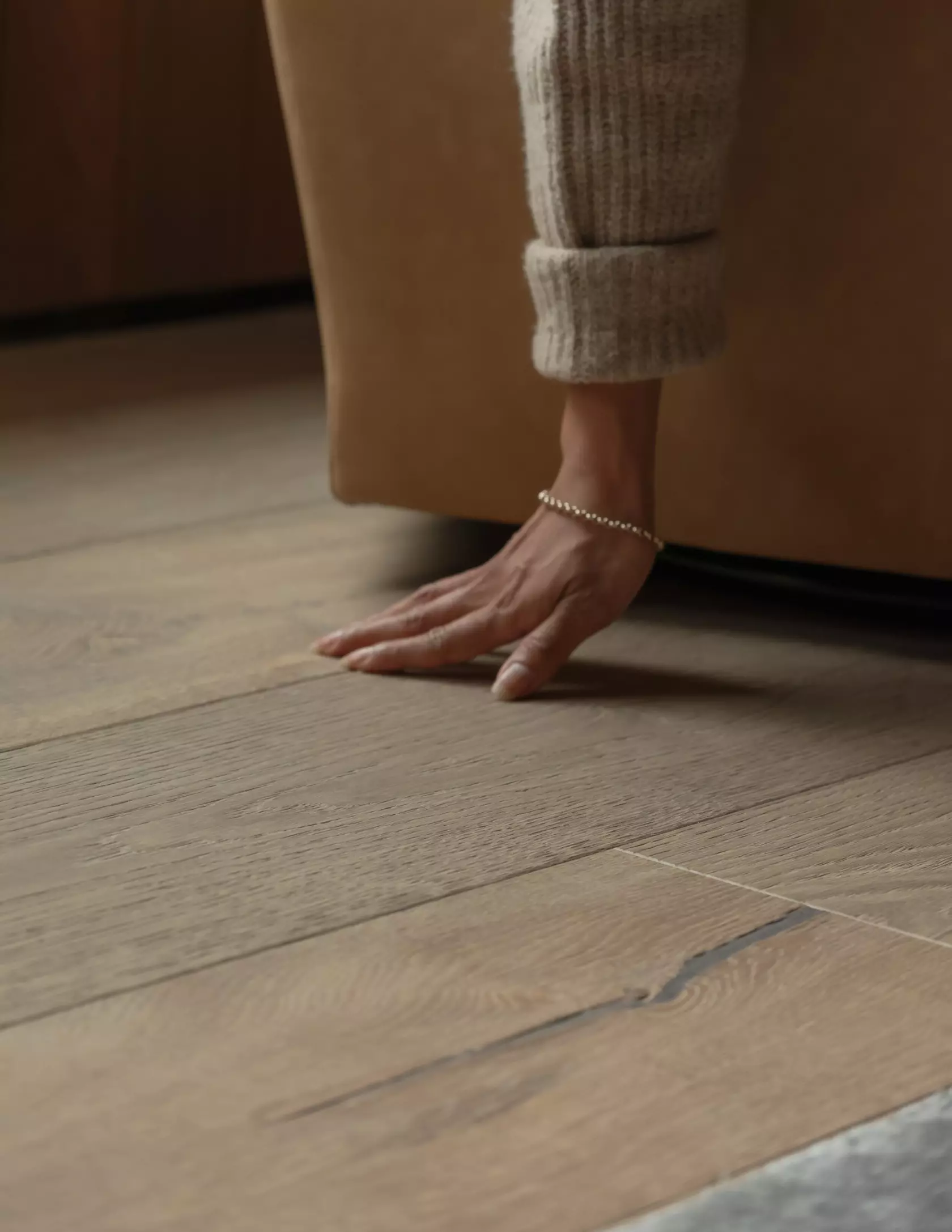
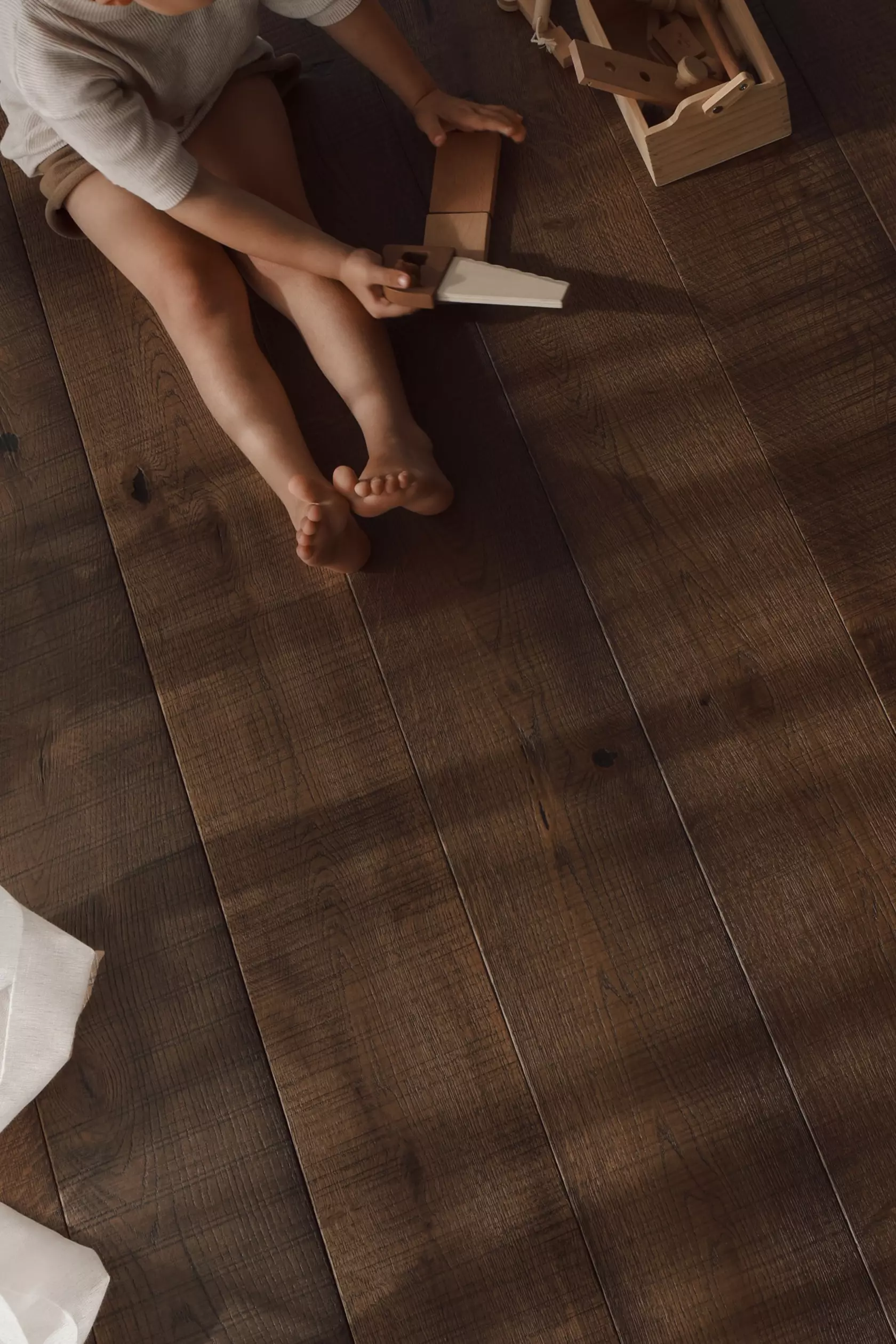
We wanted the floor to have a warmth and softness that would balance the architectural elements of the house. The Moda Capri flooring gave us that sense of warmth while still feeling contemporary. We were also conscious that the floor needed to be practical and able to cope with everyday life (including a dog!).
How much did family routines — cooking, hosting, kids outside — shape the floor plan?
At Rogan Nash Architects we design architecture for a lifetime of living, so the house was designed around the way we actually live. The kitchen is really the heart of it. We wanted to be able to cook while still being connected to everyone else, whether they were at the dining table, in the living room or outside. The scullery allows us to keep the practical mess of family life slightly contained without separating the kitchen from the rest of the house. The connection to the outdoor areas was equally important. We can move easily between inside and outside, and the living spaces open onto the garden so that entertaining feels effortless. We also wanted spaces that could accommodate different levels of activity at once. Someone can be cooking, someone watching TV, someone doing homework and someone outside. That sense of connection, while still having a little separation, was really important to us.
This is the second home you and Kate [Rogan] have designed for your family. What did you do differently this time, having been through the process once before?
Much like the last house, it was about designing a framework for the everyday moments that make up family life. It reinforced something that is really important to our design philosophy: designing for everyday moments. We thought about all the small, ordinary things that happen in a home. Where you sit with your morning coffee, how you move from the kitchen to the garden, where you retreat with a book, or where everyone naturally gathers at the end of the day. We were interested in creating a sequence of spaces that could support different moments of family life.
Is there a space that's become more important than you expected once you moved in?
The snug has become more important than I expected as it is incredibly versatile. It’s now the teenage hangout, a quiet place to read, or somewhere to retreat to at the end of the day when you want to curl up and switch off. It gives everyone a place to be together, but also somewhere to escape to when you need your own space. The larger living spaces bring everyone together, while the snug gives us another layer of separation. Its an idea that we call together alone, it means the house can accommodate different things happening at the same time without everyone feeling on top of each other.